

Introducing: Analytics


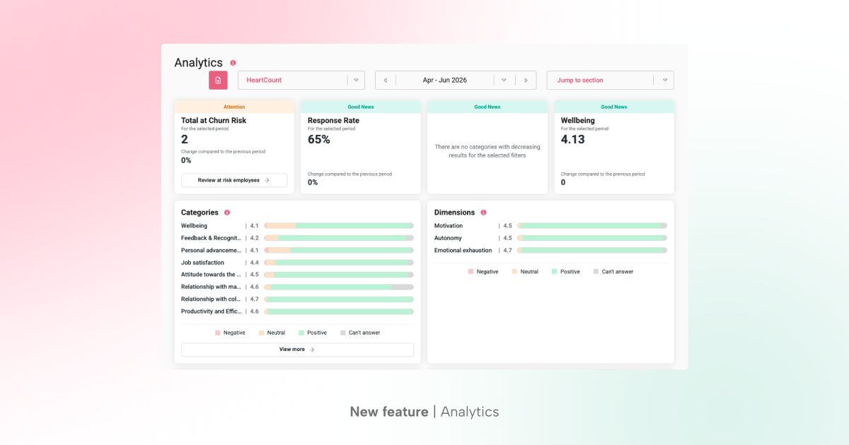

Running an engaged workforce means keeping an eye on a dozen different signals at once – response rates, wellbeing, churn risk, kudos, comments, eNPS, and more. Now you can stay on one HeartCount page to get the full picture, without clicking through the app and piecing it together in one concise view.
Analytics is a new page that pulls everything you care about into one place. Pick a team, pick a period, and see the state of your organization in seconds – with a click-through to every underlying report whenever you want to go deeper.
What Analytics gives you
Analytics is built around a simple idea: show the headline first, let people dig deeper if they need to. Every section on the page is a summarized view of an existing HeartCount report – so the numbers you already trust are just presented faster, and each one links straight through to its full report for the details.
At the top of the page, a team picker and date picker let you slice results however you need – by team, by period, from a single Pulse Check up to a full year.
A “Jump to section” dropdown lets you skip straight to what matters to you, and a PDF export lets you share a snapshot with stakeholders who don’t need full HeartCount access.
Here’s what’s on the page.
Good news, attention & urgent
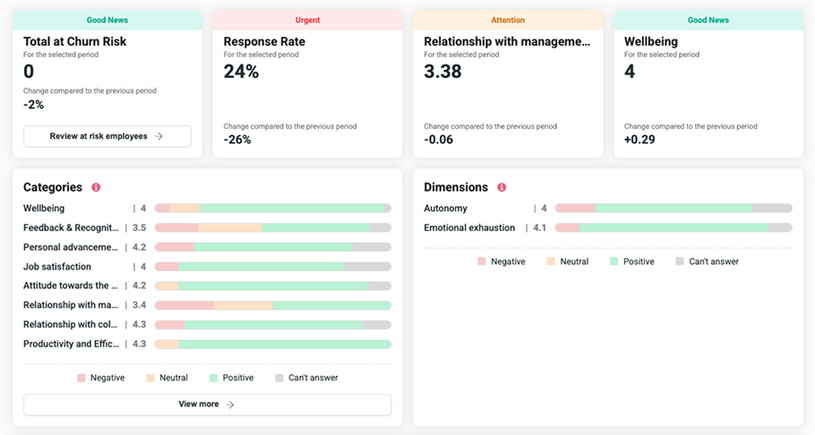
Right at the top, four cards give you an instant read on where things stand: high-risk employees, response rate, your fastest-declining category, and wellbeing. Each one is automatically flagged as good news, attention, or urgent, based on how it’s trending – so you know in one glance if it needs immediate attention or closer monitoring.
Categories & Dimensions
A compact breakdown of how employees answered across every category and dimension surveyed in the selected period – scores plus the split of negative, neutral, positive, and can’t-answer responses.
Only what was actually asked shows up, so there’s no guessing at gaps.
Kudos
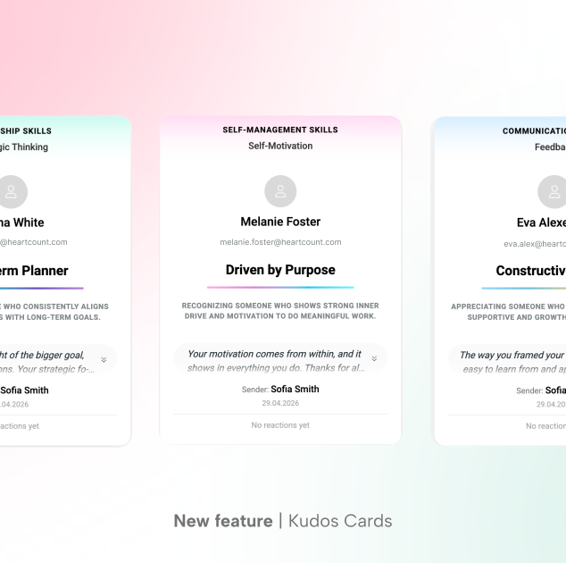
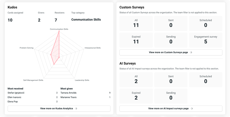
See recognition in action: cards given, top category, and your top givers and receivers at a glance, with a chart showing how kudos are spread across categories so you know what your team’s strengths and weak spots are.
Custom & AI surveys
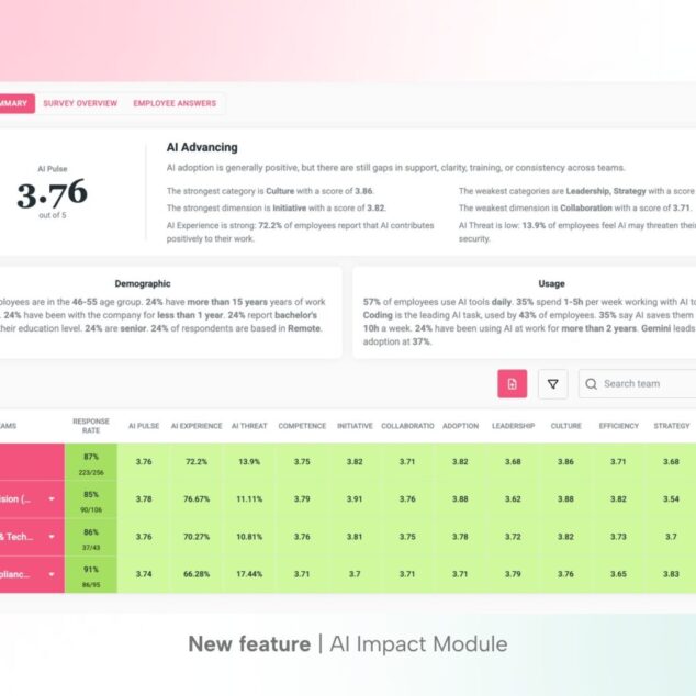
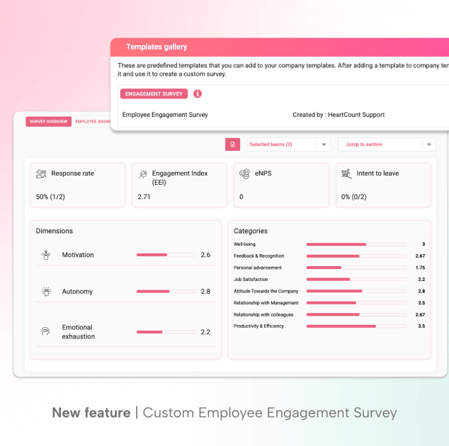
A running count of every custom survey your organization has sent – and, if you’re using the AI Impact Module, how many AI surveys are part of that count too.
Employee signals
Seven focused cards flag the employees who need attention for different reasons: declining results, sustained unfavorable answers, employees who’ve gone quiet on the Pulse Check, unsubscribes, new hires, and deactivations.
Each card links straight to the filtered employee list behind it for more details.

Pulse Check comment analysis
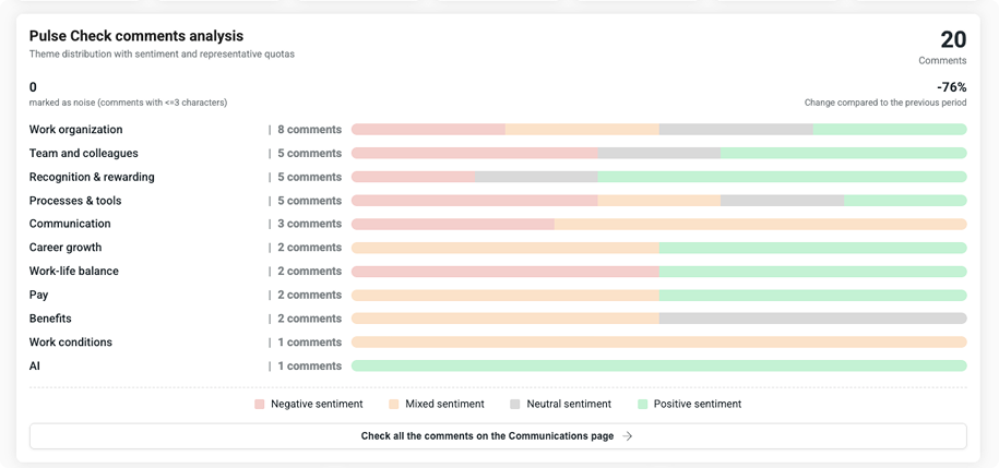
If you’re using AI comment analysis, this section shows how many comments came in, how that compares to last period, and how they break down by topic tag and sentiment – positive, negative, neutral, or mixed.
It quickly shows you what people are actually talking about before you open the Communications page for the full detail.
Historic trends
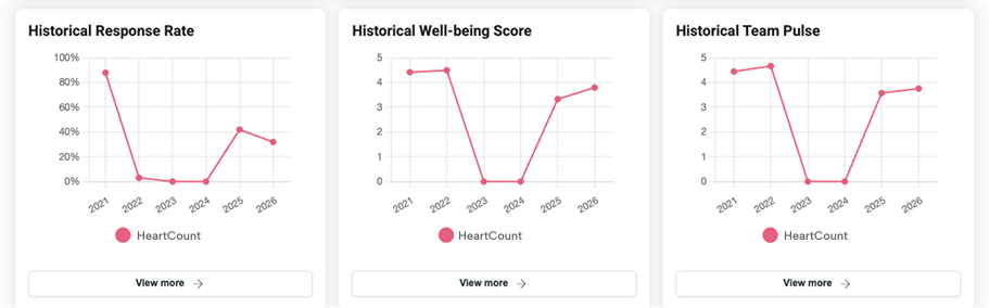
Response rate, wellbeing, and team pulse, tracked over time – the same charts you know from the Historic Data page, just surfaced here for quick reference.
Engagement Index, eNPS & Intent to Leave
For semiannual and annual views, Analytics brings in your longer-cycle metrics too: the Engagement Index from your Employee Engagement Report, your eNPS score, and Intent to Leave – including the teams where it’s climbing fastest.
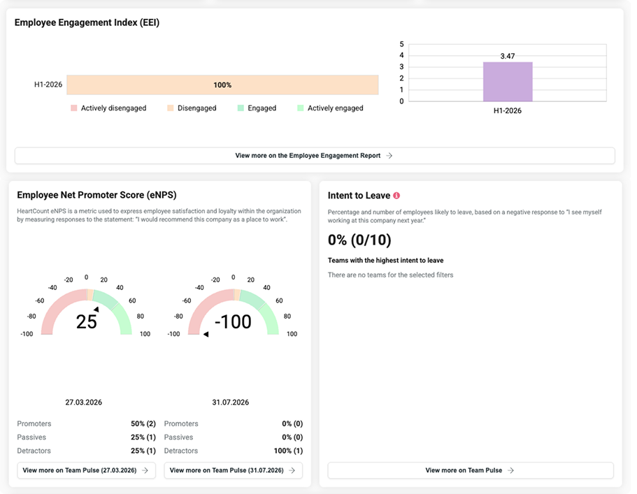
If a question hasn’t been surveyed yet in the selected period, you’ll see exactly when it’s next scheduled.
Questions & Team insights
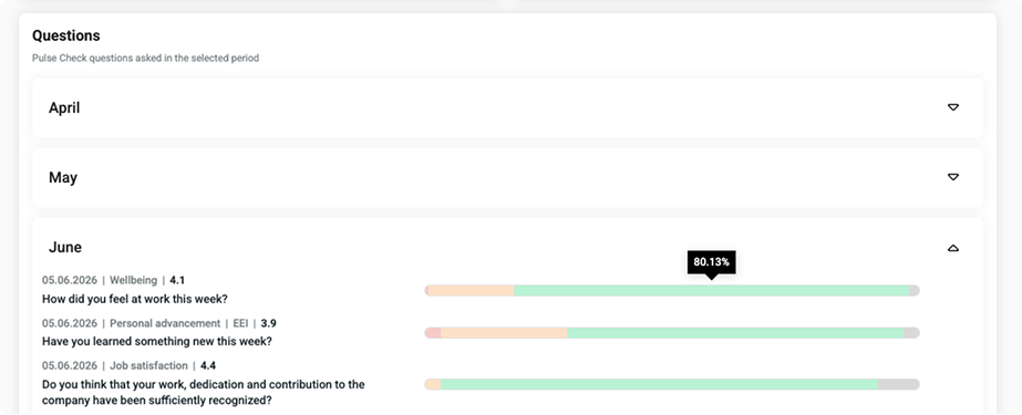
Every question asked during the period, with its scores and answer breakdown – grouped by month for longer periods so it stays easy to scan.
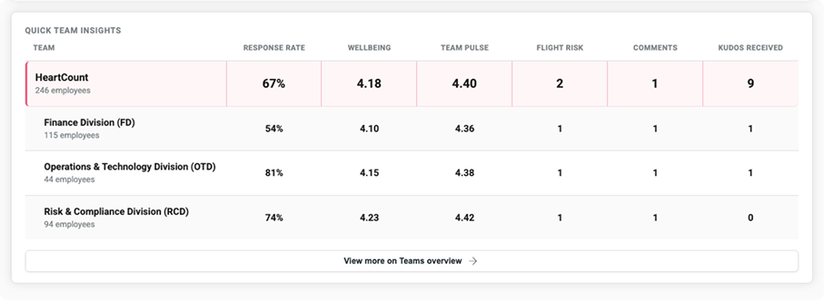
Next, a mini Teams Overview table shows response rate, wellbeing, team pulse, flight risk, and comment volume across your top teams, so you can see at a glance who’s leading and who needs support.
Built for how your organization is set up
Analytics automatically adapts to permissions. Managers without access to employee data or AI insights simply see a lighter version of the page – the cards and sections that make sense for their role, without anything they’re not permitted to view.
Admins, meanwhile, get the complete picture, including organization-wide sections like Custom Surveys that aren’t tied to any single team.
Where to find it
Analytics is available now as a new page in your HeartCount navigation – no setup required. If your organization has modules like AI Impact or Kudos enabled, those sections will simply appear; if not, the page adjusts to show only what’s relevant to you.
Stop hopping between reports to understand your organization – see it all on one page with Analytics.